Tuesday, 21 January 2014

Anything Is Possible


Still following the brayering technique of day 1 over on the PA blog, I decided to use a whole sheet of card and cut it up as I need 3 Atc's for a swap and the theme is layers. I was also more sparse with the GP and used a more open stencil.


I added stamping in vanilla fresco paint and used aquamarine treasure gold over some of the GP.


Then I added my Hero Arts flower heads with an upside down prestud for the centre. Attached the string with mini staples. Mounted each individual tag onto one piece of card and scored the middle to create a diptych.
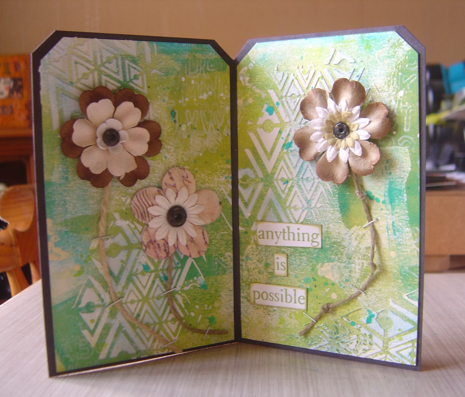

And this is it stood up.

I'm also entering into this months Arty Inklings challenge which is Springtime showing texture, some stamping and green.

Monday, 20 January 2014

Abstract Tag


Over at the PA blog there is a new designer this week, Ellen Vargo.  She made an abstract tag using a brayer to apply the paint and create the background, to see what she did check out the blog here. I pretty much followed what she did using guacamole, limelight, hey pesto and south pacific paints and the TH burlap layered stencil.


I added alphabet letters in vanilla fresco. I used wow powder to edge the tag and sectioned it off using my white posca pen. Aquamarine treasure gold and finally the images and words.

I think I put a bit too much GP on the tag as it covers up too much of the background, so may try this again with less stencilling!!

Sunday, 19 January 2014

Tissue Paper Backgrounds


White scrunched up tissue paper was glued on this atc and once dried rubbed over with black archival ink, added an image mounted on a piece of card and a couple of words.


Black scrunched up tissue paper was glued to this atc and once dried I rubbed over it lightly with pewter treasure gold. Added the image, watch parts, washer and prestud, mounted the word onto black card.

Saturday, 18 January 2014

Oriental Poppy Atc


Quite like the effect of this atc but it's not that great in the photo. I clear embossed the oriental script onto black card and lightly brushed on various colours of treasure gold. Stamped the poppy kind of image in blazing red stazon onto white card and cut it out.

Simon Says Stamp Wednesday have a theme of embossing and Artful Times have a theme of year of the horse - Chinese, but would prefer to see a horse, I don't have any horse images, so the oriental script will have to do.

Friday, 17 January 2014

Wendy V Background Makes


I made this atc using some of the background that I previously created using the Wendy V method.


Another atc using the brighter of the backgrounds. I stamped the image and outlined it in white posca pen. Added a strip of embossed metal covered in alcohol ink and 3 brads.


And another piece of the same background, again outlining half of the image with the white pen mounted in black scrunched tissue paper.

Wednesday, 15 January 2014

Canvas Atc's


Nothing much to say about these really. Selected images stamped in black stazon.


Metal rubbed over a mold and coloured with alcohol inks, gems and words added.

Tuesday, 14 January 2014

Wendy Vecchi Backgrounds


Over at CHA Wendy Vecchi has brought out some new Archival colours and re-inkers and shows a background technique here using the re-inkers. As I don't have any archival re-inkers, I tried it with Stazon and it worked just the same. I only have 6 colours, one being black. Above I used blaze red and mustard which created the orange. You can just make out the gold alcohol mixative in the middle.


This one was ultramarine and olive green and again a drop of gold mixative. This has much more of a metallic shimmer throughout.


I picked the excess up on a kraft tag but it just soaked right into the card, but the gold sort of floated on top - very cool.


I used timber brown and olive green on this one, again adding a drop of gold mixative.


This is the second lift of the same colours.


And finally the timber brown and ultramarine and the gold.


Close up of the gold shimmer although I'm not sure that you can really see the true effects here.


And the second lift of the above colours.

Unfortunately the photos don't do them justice as you can't see the effect of the metallics, but they look really cool.

***Edited***


I took these photos this morning in better light, hopefully they capture the effect of the gold shimmer.

Monday, 13 January 2014

It's Springtime at Arty Inklings


Over at Arty Inklings, Anita has set the challenge of 'springtime' but also wants to see some texture, the colour green and some stamping. So I set to work. I knew I wanted to use some tags and I'd also just got my new T!m foliage die and I wanted to incorporate some corrugated for the texture element and came up with the rough design above.


Then I painted and inked and found a bird, a flower and a button.


Then I created a background using paint, ink, stencils and stamps.


I knew I wanted it in a frame, so painted some thin chipboard pieces in black, but it just didn't work, the background was way too busy.


Then Helen Chilton appeared on the PA blog with this technique here.


But again, it was way to bright for the tags. For me they got lost in it.


So then I went to patterned paper from TH retro pad but it was too plain. Gone from one extreme to the other.


So then I tried to combine the two, again not doing anything for me.


I turned the patterned retro paper over and settled for this.


Close up of the LP image in the arch.


The tag with the flower.


The door which you've seen before in a previous post.


And the birdie tag.


And finally the foliage using my new TH bigz die.

I got there eventually!!!


Sunday, 12 January 2014

Playing with Portfolio Pastels


There's been loads going on again this week over at the PA blog. The last surprise was a tag by Helen Chilton, you can see it here. I covered an A4 sheet of copy paper with words and letters.


I ripped the A4 sheet into pieces and stuck them onto an A3 sized piece of card as above.


Chose 4 colours of Portfolio Pastels, red, red-orange, yellow and green and randomly coloured sections.


Then I blended all the colours with my finger.


I cut a section off to make 2 tags and a postcard and removed some of the colour with a baby wipe and a stencil.


Stamped the LP oriental images onto white card, cut them out, added the red and adhered to the background pieces.


Close up of the individual tag.


And the second tag.


And finally the postcard.

Saturday, 11 January 2014

Off With Her Head


Background coloured with various shades of green and blue fresco paints through lots of different stencils until I was happy with what I had. The main LP image was stamped onto the tag and also onto a separate piece of card. Coloured with tango, submarine and zesty zing fresco paints as they are translucent so I could just paint directly over the top of the stamped image. Cut the image out and placed it over the top of the image on the tag. Added some words and a bit of doodling. Oh and obviously I chopped off her head and gave it back to her to hold in her arms.

Friday, 10 January 2014

Extraordinary Atc


I have no idea why, but this has come out orange even though I used a blend of permanent red, shade and dark pan pastels. Stamped the PA image in black archival over the top and framed it with a barbed wire stamp from GreenPepperPress, The WayWard Collection, Hot Topic plate.

I specifically made this atc for the PanPastelUk challenge as although it is an anything goes week you get more brownie points if you follow the theme with the DT, which is frosty finish, hence the reason I ran a piece of acetate through a creative expressions folder to create a frosted finish which you can just about see. Then I went back and read some more and what it really meant is snow or frost - duh!!!

Thursday, 9 January 2014

Home Sweet Home


Over at Tag Along challenge this week they have a theme of home sweet home. As you can see I have a front door tag. It is eventually going to make part of a larger piece, so I will tell you more about it then.

Blog Archive