Thursday, 9 January 2014

Stamping into GP


I covered a couple of pieces of chipboard with a decent layer of grunge paste. I sprayed a couple of T!m's rubber stamps with water and stamped them into the tacky paste. I left them overnight to completely dry. As you can see, I got some great texture.


Coloured with lumiere paints in blue and purple.


And pewter and rust. I wanted the silver a bit brighter so added in some of the blue.


I went over it with black paint and added the word Soul, but you can't really see the effect in this photo.


Got great depth and texture from the GP though.


And this angle shows the black paint better.


I used lots of different colours of treasure gold over this one to bring out the texture.


From this angle you can see the shimmer the treasure gold gives.

Wednesday, 8 January 2014

Canvas Atc's


Remember the pieces of canvas that I coloured previously here, well today I used some of them. I stamped the dragonfly image in versamark and heat embossed it with black wow powders. The images down the right are stamped in black stazon from a Traci Bautista stamp. I then coloured the wings and circles with distress inks, seedless preserve, dusty concord and faded jeans.


I again embossed the D stamp, top right and stamped another TH image down the left but it's very faded.  I stamped the PA image onto a separate piece of card, coloured it with Victorian velvet and added some wings. I tried to add some machine stitching, but had stuck the canvas to the backing with red liner tape and the needle kept getting glued up and the thread snapping, so I gave up!!

Tuesday, 7 January 2014

Shades of Blue


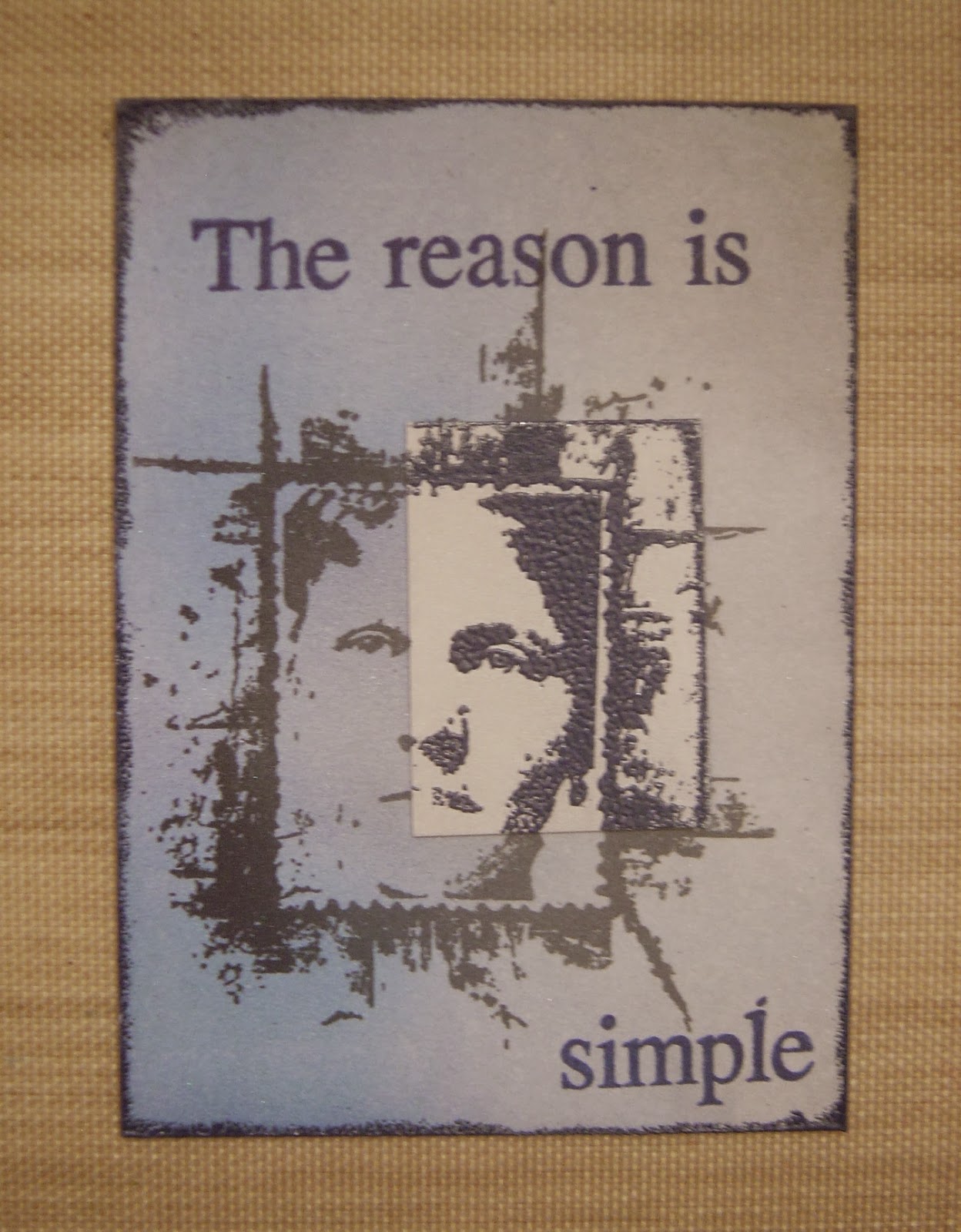
Over at Artful Times they have a theme of shades of blue. The background is coloured with a light and dark shade of pan pastels. I stamped the image and then re-stamped part of it in versamark and embossed with blueberry wow powder onto a separate piece of card which I coloured with silver pan pastel, I also edged the atc in the blueberry powder.  The PA Words are stamped in ultramarine stazon.

Country View Crafts have a theme of monochromatic, ie hues of one colour, my colour is blue.

Simon Says Stamp Monday also have a theme of blue for this week too.

Monday, 6 January 2014

Altered Wooden Spool


Over on the PA blog there is loads going on including the launch of the new GD.  This week it is the turn of Clare Lloyd who invited us to alter a spool, you can see hers here.  Above is my version.


I coloured the spool and wooden cogs with a mix of tango and blood orange fresco paints. I stamped various LP images onto a piece of card, coloured them with Portfolio pastels and cut to size to cover the middle of the spool.


Close up of the spiral wire attaching the body, head and castle hat.

Tag Book


I wanted to play with my new Sara Naumann stamps by PaperArsty.


So decided to make a tag book.  I cut 4 tags to different sizes.


This is the full sized #8 one for the back.


I used distress paints through stencils, and brayered on distress stains.


Added various colours of distress inks and more PA stamps from the minis and LB range.


Idea-ology reinforcements and flicks of white Dylusions were added.


And finally I made a piece for the front with a mini tag attached to it.


And this is the tag book put together. You may or may not of noticed that the front piece is now the other way round. I messed up when I was punching the holes!!

PanPastelsUK have an anything goes theme this week.

Sunday, 5 January 2014

Colouring and Bleaching Canvas


As my roll of canvas arrived yesterday, I decided to have another go at the bleaching effect with dishwasher rinse liquid.  This time I used a very thin layer of paint, this is London bus fresco paint and it's come out really well, but unfortunately the photo doesn't show it very well.


This one is yellow submarine and I poured the dishwasher rinse on in specific places.


Tango for this one and after pouring on the dishwasher rinse I  used screwed up tissue to create patterns in the liquid.


A very thin layer of beach hut fresco paint and it's come out really well, but again, photo doesn't do it justice.


Then the downfall, it doesn't like the opaque paint. Even though I really, really watered the guacamole down, adding the dishwasher rinse didn't do anything!!


So I tried it with limelight as I wanted a green, although it's come out more yellow than green!!!

I have an idea for what I want to use them for but I'm still waiting on post - watch this space!!!


Saturday, 4 January 2014

Kraft Core Embossed Backgrounds


I had a play around with some Kraft core card and embossing folders and sanding them back to reveal the contrast of the core colour.  I cut some spellbinders cogs to add to this piece.


Black fresco paint was added to the background to give more contrast.


The chipboard frame and outer edges of the atc were embossed in black embossing powder, a rub on was rubbed onto acetate and placed over the image.


Another heat embossed frame this time in platinum. The words 'the voices' are coloured with stream and slate alcohol inks and black fresco paint.


Text book paper, T!m's grunge butterfly stamped onto acetate and placed over the image. The word is stamped from my new Sara Naumann plate from the Craft Barn Sale.


All four Atc's, side by side.

Friday, 3 January 2014

First tag of 2014


T!m posted his first tag of the New Year and what a cracker it was too. I mostly followed what he did, but used the alarm clock as opposed to the stop watch.


The embossed cogs and idea-ology parts, cogs, spinner and gears.


The ticket was stamped with part of a saying from my new classics #5 plate. I also flicked on some Dylusions graphite ink. I think this colour is now discontinued as it's in the old style bottle!!


And finally my embellishment.

Tag Along have a theme of tickets this week, so I'm going to enter over there too.

Thursday, 2 January 2014

Resist Canvas Play


I'd read about a canvas resist technique using dishwasher rinse aid, which in this case didn't work, but that's because I put the initial layer of paint on way too thick. Anyway after a bit of wetting and drying I ended up with these.


I cut them into squares and played around with stamping on them using stazon and archival. The archival definitely came out on top.


These images were all stamped in archival.


I used the strip of faces from my new TH classics #4 plate, the outer images are stamped in stazon and the middle in archival.


And this one was a bit more tricky as the base colour was black. I stamped the LP image in archival, masked it off and stamped the background image in versamagic cloud white, but it didn't show up too well.

Obviously they all need a bit more work when I decide what to do with them. I'll probably take my white posca pen to them and maybe add some machine sewing, we will see, but that's for another day.

Wednesday, 1 January 2014

Making Faces


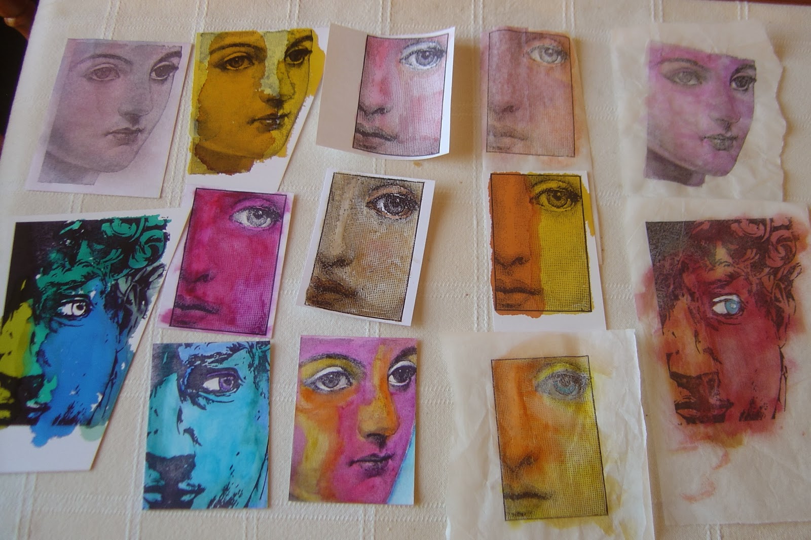
I stamped 3 styles of faces onto various different bases, ie matt card, glossy card and different thickness's of tissue paper.


Then I played with some backgrounds using silver mirri card, embossing folders, alcohol inks and treasure gold.


Then black card, embossing folders, metallic pan pastels and treasure gold.


And created these. Here they are in more detail below.


Image from T!m Holtz Classics #5 set, coloured with portfolio pastels on white matt card. Background embossed script coloured with metallic PP's and a piece of embossed mirri card and words added.


Left - Sunset and Lemonade alcohol inks onto glossy card, pieces of coloured cd added to decorate.
Middle - coloured with distress marker pens, ripped and posca pen doodling added.
Right - coloured with portfolio pastels, ripped and edged in black pen. Piece of blue coloured acetate over eye.
Image used on all by Hampton Art and all mounted onto plain black card.


Image from T!m Holtz Artful Artifacts stamp plate. Coloured with portfolio pastels, mount onto black card. Silver mirri card embossed in Dymo machine with 'obsession' and coloured with stream alcohol ink and black paint. Cd pieces used to embellish.


And finally this image was stamped onto glossy card with versa mark and heat embossed in black embossing powder. Coloured with metallic colours of perfect pearls, added onto a piece of black card and white posca pen doodling.

Blog Archive