Thursday, 30 July 2015

Last Two Art Journal Pages


More magazine pages used to create the border and the characters. Background is lime Dylusions paint. I also did a bit of doodling around the edges.


I added a couple of accessories, some writing and a few more doodles.


Border created with stamped images on various papers. The collage is stamped fabric images sewn together.


Close up of the sewn pieces of stamped fabric.


More close ups using the zig zag stitch.


I drew loads and loads of black circles to fill in the painted space and then put a white dot in the middle of each one.

Now I just have to make my covers so I can bind them and put my book together.

Tuesday, 28 July 2015

A Couple More Art Journal Pages


For this one I created a very deep border using stamped images on paper and fabric and added 5 of the same main image and an odd one to the right.


And outlined everything with a black smudgy pencil.


Red Dylusions and then created a border using only words cut out from magazines.


Played around with some images.


Finally stuck everything down and then................


added some writing and some doodling. Whilst we were away at the James weekend we had various attempts at different styles of writing. I did the lower case non joined up for this one!

Sunday, 26 July 2015

More Art Journal Pages


Another Andy Warhol style page using 'spare' images from my James weekend.


Another of my gelli print pages.


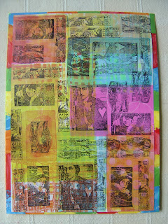
More Lynne Perrella stamped images using black stazon.


Mounted onto a piece of card painted with multi coloured edges.


Some parts from the images were outlined in white Posca pen.


The white heart is outlined in white Posca pen.


The border for this page was created using strips from magazine pages along with the pieces to create the main image. 


I added some writing and did a bit of doodling to finish this page off.

Saturday, 25 July 2015

Art Journal Pages


I used my new 3" x 5" gelli plate and some stencils to create this page using DecoArt multi surface satin paints and the pink is the Dina Wakley one.


I stamped some Lynne Perrella images in black stazon and some random alphabet letters.


I stuck the A4 page to a piece of 9" x 12" card and coloured the edges with orange and green neon DecoArt Paint.


Then I took my white Posca pen and hi-lighted some of the letters.


Another page based on the James weekend. Lin very kindly lent me this stamp, I love him so had to do a full page of him before he went back. Image is stamped onto various backgrounds in various colours of stazon ink.


And another of the background techniques from the weekend. 3" squares cut from magazine pages, and then shapes punched out and randomly stuck on.


Instead of adding fibers I added netting from the tangerine bag we got today whilst shopping.

I'll be back with more pages as I'm making myself a book.

Friday, 24 July 2015

Tag & Atc Swap - Stencils


Background brayered with DecoArt multi surface paints, knocked back with white gesso. Black modeling paste through the diamond stencil. Marks made with bottle tops in black and white gesso. Script stamped in black stazon. Die cut umbrella man, painted in black gesso and black modeling paste applied to the umbrella for added texture.


Background randomly gesso'd, yellow media mister added and red drips. Rouge chalky paint through Andy Skinner burning rubber stencil, bumped it using white gesso. PA mini stamps in blazing red stazon and some script and Finn stamps in black. Main image is from Dina's silhouette plate, stamped on a separate sheet, cut out and mounted on 3d foam. 


Close up of the bumped stenciling.


Close up of stamped wings with media clear crackle and rubbed over with English red oxide antiquing cream.


Over stamped some of the script in red stazon and splatted red and black media mister to finish.


These two mdf atc's have so many layers. The first layer was a patina from the dazzling metallics range. Next a layer of serene on one and yesteryear chalky finish paints. Laid a stencil over and painted through with innocence. Stamped some script in black stazon and flicked some black and white media mister over them.


Stamped two of Finns butterflies, cut them out, added a safety pin and some words.

All products used are from the DecoArt range.

Tuesday, 14 July 2015

Show & Tell


Front cover made by James in fabrics, sporting the Lynne Perrella PA Image.


Inside cover which is a Teesha Moore print and then the background sampler.


No changes to this page, it's exactly how I came away with it.


I have used a black smudgy pencil around the border images and the middle images. White Posca pen dots added and circled with black Pitt pen.


This one is exactly as it left the Peaks.


And nothing more done to either of these two pages. Left one is my favourite of all.


A black smudgy pencil used around the border edges and the images.


Nothing more done to this page, just as it was although I may add some drippage.


These two pages haven't been touched any further either.


And the back page sporting James's business card.

Wasn't really sure where we were putting these as Lin wanted a show and tell when it was all finished, so here is mine.


Monday, 13 July 2015

James Sharp Workshop - Day 2


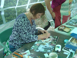
Day 2 and we were focusing on Lynne Perrella and Teesha Moore techniques.


James was having heart failure trying to control the 6 of us - hehehehe!!!


This is one of the techniques they use, random squares and punched shapes and pieces of fibers just randomly placed. Funnily enough, this was Martins favourite page!!


This next technique was my favourite page. The idea was to blend images into the images on the background so you can't see which is which and instead of it being two, it all became one.


Again, we had a bit of a tidy up and moved on to our next technique.


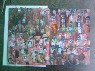
I know it's hard to believe from this double spread, but there are actually 4 different copies of photos on this page. The idea is to cut out extra heads to disguise where they join. I'm really pleased how mine came out. Using pastel crayons we hi-lighted various heads.
 

James demoing the next part of the process.


Chris hi-lighting her heads.


This is Lin's page.


This is my page with the copper and red wash over it. Tried to do drippage but the page was too wet.


Another regular boarder page, this time from magazine pieces.


Everyone creating their borders from magazine bits.


Then we made people using different body parts and accessories and again, I was dared to write in the leftover space.


We also created an irregular border and had to incorporate an image in one of the corners using it to create the border. Added another image and some more writing.


Then we were given the choice of some Teesha and LP papers to put in our books to hide the covers as James had very kindly made us all a cover to put our books in.


This is the back page. The left hand page was just for us to add random images as we went along.


This is the front cover which is all fabric.


And this is the back cover, again all fabric.


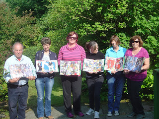
And the show and tell, James, Helen, Em, Lin, Chris and Linda.


And I lifted this one of all of us off James's blog post.

Thanks everyone for a lovely, fun filled weekend.

To see more of our weekend check out - 

Blog Archive