Showing posts with label Adirondack Dye Ink. Show all posts

Saturday, 13 June 2015

Fathers Day Cards


Made a couple of fathers day cards from one of last weeks gelli print pages and die cuts.


I think the piece at the back looks a bit like a map, very fitting!!

Sunday, 28 December 2014

Gelli Jump Start Journals


This year I made some gelli jump start journals inspired by Patti Tolley Parrish.  She made her debut in the November edition of Cloth, Paper, Scissors and kindly made a series of youtube videos to go along with it to show how they are made, so I had a go.  They have been given as Christmas presents this year.


I included a tag in with each one with an explanation on the back.


And this is how it read.


Each journal has 3 signatures and each signature has 5 double sided pages.


As you can see some pages have lots of colour.


Some pages have lots of white space.


The idea being that you use them as a journal, but aren't faced with a blank white page.


A bit of something to get you started.


You could either doodle in the whites space or


gesso over the page and add your own background.


The pages make great starting points.


Close up of the beading after binding in the signatures. The covers are gelli printed onto cotton fabric.


I hand stamped some tissue paper to make my own Christmas paper to wrap the journals in.

Sunday, 12 October 2014

Gelli Plate and Ink Pads


When we went to Port Sunny Tracey from Lavinia stamps was demo-ing a gelli plate and using ink pads as her medium, as opposed to the traditional acrylic paints. You can actually see what she did at the show on her video here. I used Adirondak to brayer on the background, but only have a black versa fine pad, so instead used Stazon. As you can see, it didn't work, it left white spaces. Oh and the image fell off my acrylic block too!!!


So I tried again, but this time used distress inks to stamp the images onto the gelli plate and as you can see, this worked much better, at least the colour came through this time.


As I didn't know if it would work or not I didn't take too much care to make sure it filled the whole page, so I brayered across the top and edged with walnut stain distress ink and coloured the main LP PA image with distress ink markers. I think it needs some more black on it to balance it out so I may add some random script or I may cut up a quote and add it.

Friday, 24 January 2014

Jo Inspired House


Jo Myhill is back on the PA Blog with a DT spot and she's decorated a wooden plaque in the shape of a house which you can see here. I used the above wooden shape for my make.


I pretty much followed what she did with the technique and colours, but used different minis.


Instead of using UTEE on the heart, I gave it three coats of PA glossy glaze and as I'd used adirondack wild plum to stamp the flourish it reacted with the glaze.


Here is a close up of the heart and flourish image.

I'm also entering into this weeks PanPastelUk challenge which is to use a base other than card or paper.

**Edited**
Just for the record, no pink was used in this make!!!!

Wednesday, 9 October 2013

Beyond Normal - Dolls Houses


Over on the PA blog, Alison has been back this week with 3 projects, this is my take on her 3rd project which you can see here.


I only have one of the dolls plates so I had to improvise with faces and houses from other plates.  I stamped in timber brown stazon and over stamped in cranberry and wild plum adirondack ink.


I then pieced them together and mounted them on to the background.  I stamped the words, images and script with wild plum.


Close up of the left side.


And the right hand side.


And then here comes the wacky bit which make this project so much fun. Out came the black posca pen and the cranberry and wild plum adirondack pens.


Close up of the left hand side housing their new features.


And lastly close up of the right hand side!!!

Sunday, 7 October 2012

Just One Colour - AJ


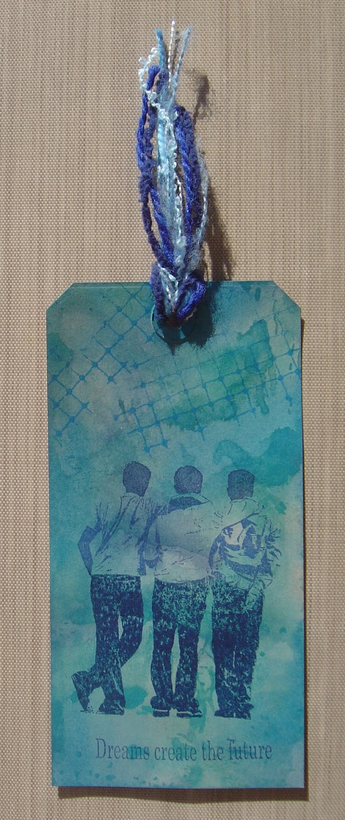
Over at Art Journey this month they are asking for 'just one colour' to be used in our creations.  So I challenged myself to use blues.  I used denim, faded jeans and broken china distress stains for the background.  I used Stazon Hydrangea blue for their trousers, Adirondack Denim for their shirts and Salty Ocean Distress Ink for their heads!!!  


Then I decided to try orange.  I used Dylusion ink sprays, squeezed orange and orange with a splash of mica which is one from the pre-Ranger Dylusion set.  I used a mixture of spiced marmalade and dried marigold distress inks for the middle of the main image.  I went around the outside frame with Stazon pumpkin.  Once stamped I added orange distress stickles to further outline the frame.


Then of course I had to try a green one.  The background is a mixture of shabby shutters, peeled paint, crushed olive and bundled sage distress stains.  The main image is stamped in meadow Adirondack ink.

Sunday, 20 May 2012

Take a Stamp


I have seen in some Stampington magazines where a stamp is chosen and used in different ways, so with this is mind I set off having a play.  I decided to choose my new Art Journey 'Pear' stamp from the aptly named Pear plate!!.  As you can see I made an arch, an atc, a couple of tags and three cards.  This is a long post as I am going to explain each one below.  So either grab a coffee or carry on blog hopping!!!


The arch ~ stamped background using distress inks, adirondack dye inks and stazon in shades of purple.  I then gave them a light dusting of violet shade and ultramarine blue extra dark. I stamped the two pears onto tissue paper with timber brown stazon and cut them out.  I gave the arch a coat of golden matte medium, laid the first pear on and gave that a coat too and then laid the second one over the top and coated that too.


I used glossy card for both the background and the card.  The white card is stamped with olive stazon using the image from the TH papillon plate.  The pear is stamped in black stazon on to glossy card as the background was created using juniper, lake mist and willow alcohol inks.  Edged with forest moss distress stain and smudged in.  I used my one and only distress marker, picket fence to squiggle underneath the pear so it didn't look like it was floating, not sure if you can see it on the photo or not.


This is my least favourite one and the one I did last.  I covered the background with yellow and green Stewart Gill translucent paint.  I stuck on a few pieces of music script and added a bit more paint.  I inked clear ink through a piece of sequin waste and coloured it with burnt sienna extra dark pan pastel. I stamped the pear in versa mark but because it was dark by this time and the light wasn't good, I couldn't see where I had stamped to put the pan pastel and I was a bit heavy handed with it on the left hand side while I was sussing out the image!!!  I stamped the words in timber brown stazon and coloured it with some other Stewart Gill paints.


Atc ~ I stamped the pear in 3 shades of green using colorbox fluid chalk inks from the Autumn Pastel range.  I masked the image off and stamped the CI music background with saddle brown stazon.  I used orange extra dark pan pastel to colour the background.


I stamped the pear image on the plain white tag in bamboo leaves Memento ink, masked it off and stamped the twigs image (from the same plate) in various colours of distress inks and adirondack dye inks.  I spritzed it with water and stamped it onto the tag.  I took the scroll from the same pear plate and again used various colours and randomly stamped it on the tag corners.  I took a wet paintbrush to my art bars and coloured the background of the tag.  I used forest moss distress stain to edge the tag and added the fibres.


I stamped a script Paperartsy image in versa mark all over the tag.  I used ultramarine blue extra dark pan pastel to highlight the script.  I went over the whole tag with a combination of violet shade and turquoise shade pan pastel.  I stamped the pear images in cool peri and eggplant adirondack dye inks, cut them out, mounted them onto the tag with 3d foam and added fibres to finish.  I edged the tag in dusty concord distress stain.


And this is my favourite one, a card.  The three pears were stamped in olive, timber brown and saddle brown stazon.  They were masked off to create the effect.  I gave them a bit of shadow using my artbars.  I edged the card with one of the greens from the Colorbox fluid chalk autumn set as above.  I stamped the word 'friends' in timber brown stazon on a separate piece of card, edged it and stuck it on the card.  The whole thing was then attached to a white card.

Monday, 25 July 2011

Butterfly Twinchies


This months twinchies theme on UKStampers is butterflies.  As most of you know, I only have the one butterfly stamp, so I've had to use it a few times here!!!  The first image is stamped onto a really thick vellum, I cut it out and just stuck it down the middle so the wings are free.  The 3 multi-coloured ones are adirondack inks spritzed with water to give a watercolour effect.  The middle bottom is from a paperartsy stamp set and the bottom right is stamped in timber brown stazon.

Monday, 13 June 2011

Simon Says Torn and Tattered


This make is for Kate.  Kate is colourblind and thinks I use pink when in fact it's red or a combination of reds.  So Kate, this one is especially for you.  Yes, it is PINK!!!  I used pink sherbert, raspberry and tattered rose inks to stamp on the blue card and denim to stamp on the PINK card.  I tore the pieces of card out and edged with faded blue and spun sugar distress stains.  The background card started off white and that was coloured with weathered wood, spun sugar and antique linen distress stains.  It was stamped with faded jeans stain.  All images are from stampers anonymous plates.  I scrunched the PINK card, swooshed the inks over it and then ironed it flat ready to stamp on. 

This week Simon Says Stamp are asking for distressed / torn edges.

Thursday, 26 May 2011

JFF - Week 17 - Tea Cards


Well another challenge from Neet over on JFF.  This week she is asking for 'tea cards'.  Again, another new one on me, so had to go investigating.  Well apparently they have to have a white border all the way around.  The size is very small, 36mm x 68mm.  I used part of a CI stamp, inked them up with various colours of adirondack ink, spritzed them with water and stamped them.  Once dry I shaded the background with distress inks.

Tuesday, 24 May 2011

Grungy Monday #8


Over on Grungy Monday for week 8, we are using a t!m technique to create watercolour images using Adirondack dye inks.  I needed a thank you card and used the off cut to create a scrapling.


As my one and only butterfly stamp went down so well on my previous clean and simple card where I used distress inks in the same way, I decided to use it again.

Monday, 4 October 2010

Stampotique Twins Tag


I took the last lot of stamps back and exchanged them for some different ones.  I stamped two of these images onto white card, coloured one with shades of blue and the other with shades of green.  I used water coloured paints on both of them.  The tag is coloured with shades of blue distress and adirondack inks.  I splashed water over the tag and dabbed it with kitchen roll to remove some of the ink for a more distressed look.  I stamped and edged the background with walnut stain distress ink. The images are attached with silicone glue.  The word 'twins' was created with a dymo labeller.  I added 3 square blue gems, a clear round gem and string to embellish.

Saturday, 29 May 2010

Postcard/Mail Art - Lotstodo Challenge


Back to my favourite stamps of the moment for this challenge piece. I chose a postcard, covered it in various bright colours of distressed and Adirondack inks. I used black soot distressed ink to stamp the triangle eye images, covered them in clear embossing powder and heat embossed. The background and words were stamped in black stazon. I ran round the edges with a paper distressing tool and inked with black soot.

Blog Archive