Wednesday, 25 May 2016

Affirmation Stones


Over on the FB Mini Marvels page Angie has started off a bit of a craze by creating some affirmation stones from a tutorial by Mark Montano of DecoArt which you can see here. So I got the bug and here is my take on them, the hardest part was finding some stones!!!


The background colour is quinacridone red, I used it because I wanted to use red, but this one is translucent so you can still see the oriental text underneath. I stamped the Chinese dragon in black stazon and outlined with a thin black out liner pen and centered it over the stone as best I could. I used translucent white and carbon black to decorate it.


Exactly the same process for this one, stamped the skull and positioned it over the stone. I watered down some paynes grey, again as I wanted the text to show through, translucent white on the skull and the dots. Outlined the skull and parts of it in black carbon.


And finally the last one I coloured with quinacridone violet. I free drew a heart in the white, only because I had some left from the above, added dots in black and white and then introduced the cerulean blue. Outlined the white heart in black.

All products are from the DecoArt media range.

Saturday, 21 May 2016

APC Swap - Mini Marvels


I'm in a FB group called Mini Marvels run by the lovely Chris. She had organised a swap of 9 altered playing cards. Here are my lovely collection of swaps. You can see the ones I made for the swap here.


The second part of the challenge, should you wish to take it up, was to create something to display or to keep them in. So I started to play around with a 12" x 12" sheet of paper.


Once I'd sussed out the measurements I moved on to doing it for real with black card and patterned papers.


I decided on a black and white theme of stripes and dots.


Stuck everything down, added some lettering and rounded the flaps.


And this is the back, or should I say the outside, continuing with the black and white and stripey and dots theme.


I then decided to add more info to the bottom of the pockets.


This is the book folded up, so this is the front cover.


And this is the back cover, the end sleeve is folded inside. 


I decided not to add any closures as it wouldn't sit flat if I did and I will probably display it open so I can see the contents.


This is how it looks with the flaps down, obviously they don't sit totally flat as some of the fab contents have texture.


I thought I'd finished but the top flaps looked too plain, so I got my white sharpie pen out and added some dots and lines, now I'd finished.


Then we took Fraz for a walk and it hit me, duh what a total wholly, they are not A T C's, they are A P C's!!! Luckily enough for me, all it meant was that I had to stick a P over the T - now it's definitely finished.

Friday, 20 May 2016

21st Card


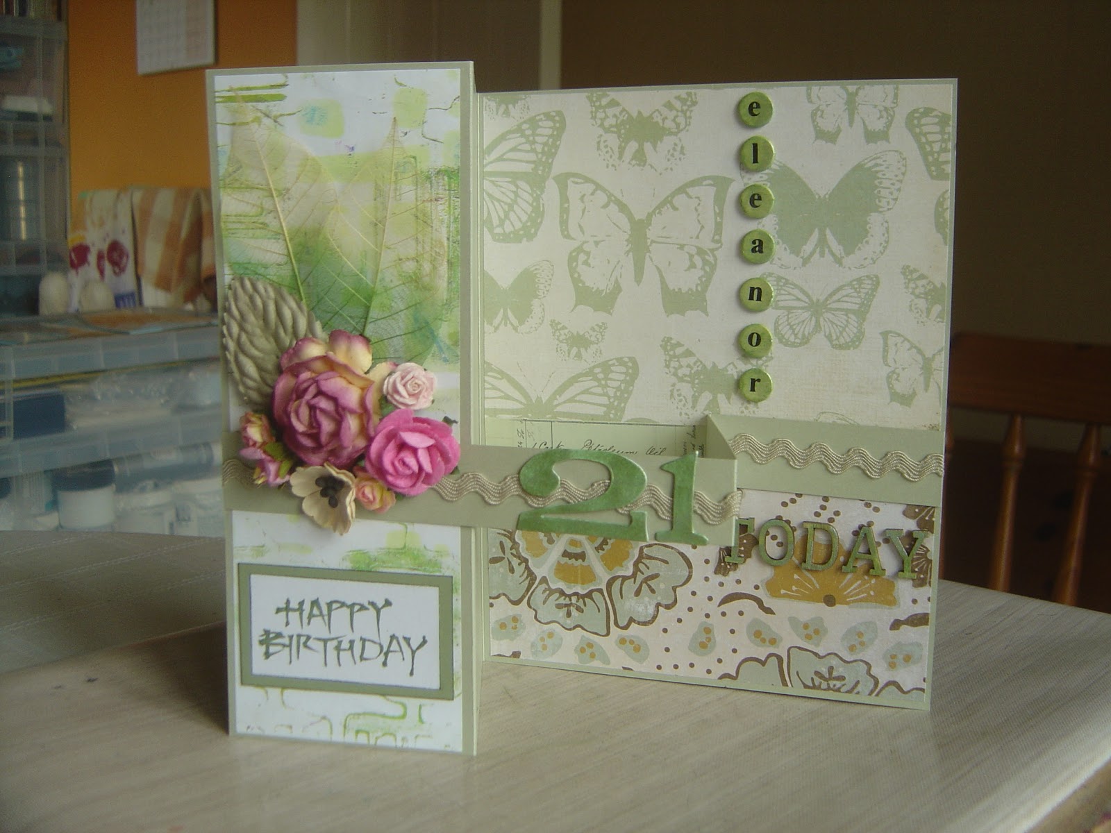
After making my mums card and her asking me to make one for her friend, after I showed that, I was then asked by one of my friends if I could make a 21 card for her in the same style and colours.


From another angle, the ladies name is Eleanor and I had to use some smaller letters so I could get all them all in.


And this is it folded, or as folded as it will go!

Thursday, 19 May 2016

Friday 13th Atc's


I started off by mixing media texture sand paste with ultra matte varnish and randomly spread it on three white pieces of card cut to atc size.


Once dry, I gave each one a coat of media paynes grey mixed with a hint of tinting base and continued to add different colours of media paint until I was happy with the backgrounds.


Next I added the images and gave everything a coat of ultra matte varnish. Once dry I applied clear crackle glaze to parts of the atcs.


I used a combination of black and brown antiquing cream over the crackles, although they blended the images into the background quite well, they didn't really enhance the cracks, so I went back in with the white. 


I cut some chicken wire and coloured it with quin gold, used mini staples to attach it and painted them quin gold too. 


I added the chit chat words and gave them a coat of Andy's dirty wash to tone down the white.


Again added a chit chat phrase and used the dirty wash to tone it down. The X is from my new dies.


I used the media mister to drip the red paint down the atc.

That's Crafty have a theme of Friday 13th.

All products are from DecoArt media range.

Wednesday, 18 May 2016

Another Flower Card


After my mum got her birthday card she asked me to make one for her friend in the same style, so that meant more flowers but at least I got a bit of green in.


And here it is stood up.

Monday, 16 May 2016

X's and Eye Tag


Had great fun with this tag. I took 6 colours of media paint and swooshed them onto the black tag with my fingers. Once happy I used the AS chevron stencil and chalky everlasting paint. Then using the original colour pallet I used the stencil again to bump the images.


Used the Andy Skinner scratch stamp in black stazon, then over stamped in media paints, pyrrole orange and blue green light. Stamped the script in whisper (off white) chalky paint. 


Again using my fingers I swirled everlasting chalky paint in a circle to house the TH eye stamp. I die cut two of the drips shapes and stuck them on top of each other at an angle, colouring them with the leftovers on the cut and dry from the stamping.


The X is the die cut from the middle of the drips set. They were coloured with pyrrole orange, trans yellow oxide and quin magenta. They were stamped with the AS script stamp in black stazon.

All products used are from the DecoArt range.


Tag, Dies and Doodling


Another tag using my new to me Seth Apter dies, black, red and white sharpie pens and a black out liner.

PaperArtsy have a new theme of doodles and scribbles this week, not sure if this will class as doodles, but if not I'm sure they'll let me know!!

Sunday, 15 May 2016

Seth Apter Style Tag


Look what came through my letterbox yesterday. So obviously, I had to have a play.


And this is what I made, dead simple but effective. The background is a gelli plate print using the prima bubbles stencil.

PaperArtsy have a theme of monoprinting for their challenge this week.

Saturday, 14 May 2016

Friday 13th


I started making a tag last night for the Friday 13th, That's Crafty challenge.


So this is where I was up to last night. But when I saw it this morning I felt it needed a little something else.


I added a few white dots, outlined the hearts in black pen and the main image in smudgy black pencil and then I was happy with it.


As I threw it to the side, it landed on this open page of my journal, and I loved it on there, so it's now become a journal page!!

I used DecoArt chalky paints in black and white and pyrrole red media paint for the background and the stamping of the tag.

Thursday, 12 May 2016

Andy Skinner Style Frame #3


Had another play with some chipboard and a frame.


I switched this one around and did the modelling paste and stamping on the inner frame. I only took one photo as the process is exactly the same as it was in the previous frame posts, but I did use different colours and missed a couple of stages out.


Dry brushed and outside edges darkened.


Unfortunately you can't see it too well here, but I added interference blue and turquoise.


Hopefully you can make out the shimmer.


Onto the outer frame which was gesso'd and painted with three shades of green media paint.


Weathered wood and white crackle paint.


Lots of greens, blues and a purple painted over the top of crackle until I was happy with the colours.


After putting it all together, I decided the outer frame needed a little something else, so added some stamping in black stazon.


Rusty washers added to each of the corners.


The chipboard die cut heart was crackled, painted with antiquing cream and most of it removed to enhance the cracks.


Stamping on the crackle and the modelling paste.

All products used were from the DecoArt Media range.


Blog Archive