Sunday, 31 July 2016

CAS Tags


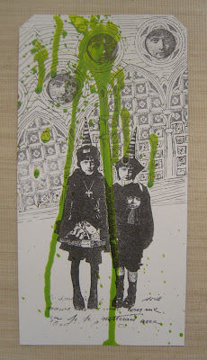
I sprayed my DecoArt media misters in orange and yellow green onto separate tags, let them drip and dry.


Stamped the Harajuku image in black stazon, masked her off, stamped the script at her feet and another of the gothic arches also in black stazon.


Exactly the same for this one except I carried on the arches with black pen and stamped the faces in the circles.

Saturday, 30 July 2016

Skull and Arches


More playing with my new gothic arches which I thought might go well with a skull, so here it is.


Close up of the skull which was created with DecoArt white modeling paste through an Andy Skinner stencil.


The arches were stamped in clear ink and embossed with white. Dripage created with DecoArt black and purple media misters.

Journal Pages


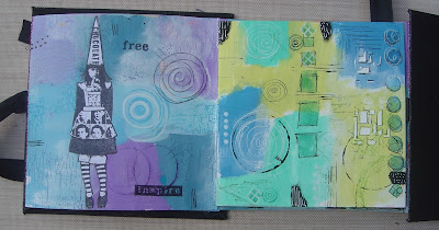
My new arches stamps came this week, so I just had to have a play with them.  The background is a mop up of my previous post where I made the mini book, the paints are from the DecoArt media range. 


I stamped the Harajuku image, then used the DecoArt white tinting base to paint over it, then I re-stamped the image using black stazon. I used a micro pen to extend the brickwork on the arches.


And I did pretty much the same with this one except I used a stencil to add some of the media paints.


Again I extended some of the brickwork so the arches met.

Paint, gesso and tinting base are all from the DecoArt range.

Tuesday, 26 July 2016

Mini Album


I was inspired by Kate Cranes recent TV appearance on Hochanda and decided to make a mini album / book. I set about decorating some pages.


And these are the other sides.  All the paints used are from the DecoArt media range along with gesso and tinting base.


This is the book stood up with all the pages added and the covers.


Now some of you might recognise the layout of this as when I googled mini book and adding signatures loads of threads appeared with Kates name and Wanderlust. I don't subscribe to Wanderlust, but it wasn't hard to work out the process.


I wanted to incorporate ALL my new to me Harajuka figures, so in order to make them stand off the page, I simply stamped them onto plain white paper. Not bad for a lefted handed stamping effort!


I had to wait a couple of days before I could cut the images out though as I couldn't get the scissor hole over my thumb properly.


I went round each one with a black pen.


I wanted to include some images from the Choc Baroque Gothic Fragment stamp plate that I recently ordered, but the order hasn't been processed yet and when I looked yesterday, they were out of stock.


So when they do arrive, I may go back in and stamp some of them, it depends what size they are.


And these are the covers. I used black gesso to cover them initially and then black modelling paste through the stencil. I had to do these left handed and pressed on that hard, I broke the pallet knife!


Once dry, I gave them two coats of media gloss varnish to make the words stand out.


I put ribbon between the cover and first and last pages and this is how it looks tied together.

All products are from the DecoArt media range.

PaperArtsy have a theme of colour mixing for their challenge this week and Country View Crafts have a theme of have fun with circles this month.

Monday, 18 July 2016

Playing along with Kate Crane & DecoArt


Having watched Kate Crane do a fantastic job on the Hochanda craft channel under at times, some pressing circumstances, I just had to have a play. By now it was dark so, sorry, but the photos aren't that brilliant. 


A pop of black was added through stencils.


Black and white doodles were added.


This piece is approx 4" x 4" and I used a Kate combination of quin magenta and yellow oxide media paint and it also created an orange where it blended using the tinting base.


I introduced three colours to this tag, sap green, pyrrole red and yellow oxide, again I used the tinting base to lighten them.


This piece is approx 3.5" x 4.5" and again I used quin magenta and yellow oxide media paint. The face stencil is from the Andy Skinner, Strike the Pose set.


The colour wave used for this selection was dioxazine purple, prussian blue hue and quin magenta.


I edged all the pieces with black to frame them as I think it just finishes them off.


The face image on this tag is from the Andy Skinner Baroque stencil.


This one is approx 4" x 4" and again the face is from the Strike the Pose stencil.


I needed a card, so I decided to use simple matting and layering to mount it.

All products are from DecoArt and these makes were inspired by Kate Crane who did a one day DecoArt Special on the Hochanda craft channel.

Saturday, 16 July 2016

Altered Brush #2


As you can see, this paintbrush has seen better days! I gave it a coat of black gesso and then a quick flash of gold media paint as I wasn't sure if it would stick because the handle is actually plastic.


And here she is, my finished brush. Decided to add more gold and gave it a coat of media gloss varnish. Added some TH idea-ology metal stickers, gems, metal gold coloured wings and the Lynne Perrella face with the crown.

All products are from the DecoArt range.

Textured Tags


I have thrown everything under the sun at these two tags! I started off by adding the following DecoArt products, clear crackle, matte medium and white crackle paint. I smeared them all over the tags.


Next I used the heat tool and made all the above products bubble to create some texture. I painted the tag with chalky finish paint in lace, then dazzling metallic silver sage, then black shimmer. Next I added metallic silver from the Media range along with a coat of paynes grey. Finally I added gold, blue, violet and magenta interference paints again from the media range.


This was done in exactly the same way except instead of the paynes grey I used carbon black and as you can see, the interference paints show up much better on a darker surface, hopefully you can see the texture.


I took a couple of cardboard mounts and added a mix of ultra matte varnish and texture sand paste. I like to add some of the varnish to the sand paste as I find it helps it stick to the project better.


Once dried, I added paynes grey, transparent yellow iron oxide, quinacridone violet and magenta and interference violet all from the DecoArt Media range.


Close up of the textured sand paste.


And finally I decorated them with metal embellishments.


I had forgotten about the strips of metal that I bought at the Version Scrap show in Paris way back when.


And the mini bottle tops with the letters I got this year from Hobby Lobby.

All products are from the DecoArt range.

Blog Archive