Saturday 30 June 2012

Stampotique Note Book


This week over at Stampotique DT there are a few changes, a couple of the DT members are bidding farewell, so this has opened up a new opportunity for new DT members to be appointed.  If you're interested click here, there is still time to apply.


So on to this weeks challenge which has been set by Val, she has challenged us to 'think outside the box' and create something out of the normal for you, so I decided to use my TH kraft resist paper stack that I got in March but haven't used yet and my BIA which hasn't been out the box for a few months either!!!  And I put together this neat little book with my 2 favourite fella's on the front and back.

Thursday 28 June 2012

Don't Fear


Well what a fab theme over at Dragons Dream TIO this week.  Sylvia has chosen 'don't fear', she is asking for a scary image, a crowd of purple and textures.  So I ran my tag through the rellie rave Cuttlebug embossing folder and coloured it with violet shade (470.3) pan pastel and added a hint of black (800.5) around the edges.  I stamped the skulls with black stazon, one onto acetate and two onto white card.  I stamped the bottles onto acetate again with black stazon.  I placed the skulls behind the bottles and cut the excess off.  The top skull has been placed behind a piece of white card.  I stamped fear your dreams from the TH, stuff to say stamp plate and cut the individual words out.  I cut a piece of wire mesh to go over the top and used staples to attach it.  I added gem stones for the eyes, an eyelet and some black fibres to finish.

Great challenge, thanks very much.

This tag won me a Dragons Dream top 3 blinkie.


Tuesday 26 June 2012

Depths of Distress


Over at Simon Says Stamp and Show they are asking for individuals interpretations of 'depths of distress'.  So for me this meant using my new set of summer distress inks and my fab Stampotique stamps.  I'm really loving these bright colours.


Again I used the summer distress inks but I stamped the circles in Perfect Medium and coloured them with yellow ochre shade (270.3) pan pastel.  I stamped the Stampotique hanging hearts image in festive berries distress ink, the heart throb Stampotique image and the TH quote in black stazon.

Sunday 24 June 2012

Born to Travel


Anything goes is the theme this week over at PanPastelUK.  I ran the Couture Creations world map embossing folder through the big shot.  I swooshed over the top of it with Perfect Medium and coloured it with various colours of pan pastels, orange extra dark (280.1), burnt sienna shade (740.3) and yellow ochre extra dark (270.1).  I went over the compass with black (800.5) pan pastel.  The background is a piece of corrugated covered in a piece of red from TH's retro grunge paper stack.  The journey is die cut from a piece of black card and laid over a piece of hessian.  The Eiffel Tower is part of a Hero Arts stamp, stamped and coloured with distress inks.

Simon says stamp and show a bit of brown, so been as I've used burnt sienna shade pan pastel and the Eiffel Tower is stamped in brown I am entering this piece into their challenge this week too.

Saturday 23 June 2012

By the Seaside Atc's


Over on the PaperPlay forum, Deb chose this months theme of 'by the seaside / beach'. Above I used distress stains with a paperbag studios stamp.


Maz lent me the stamps for these two above, they are from Crafty Individuals, CI-284.  Distress stains were used to create the background.  The top one was stamped in black archival ink and the bottom one was stamped in black soot distress stain which is why the image doesn't look as crisp.

Friday 22 June 2012

Artful Times - Challenge 7


Well I have to admit, I did somewhat struggle with this weeks Artful Times theme as chosen by Von.  She went with 'oh I do like to be beside the seaside'.  Well this totally threw me as I haven't got a single stamp that anywhere near resembles the seaside. Cue Maz; Maz has everything, luckily for me.  So she dug out this Crafty Individuals stamp and another plate which contained the seagulls so I could make this atc.  The background is faded jeans and bundled sage distress inks.  The main image is stamped in black soot distress stain, hence the rugged look and the seagulls are stamped in black soot distress ink.


I'm sure you can come up with something much better than my atc. Hop over to see what the rest of the DT produced and don't forget to link up your entry and not your blog to stay within the challenge rules.

A Little Book


Over at Out of a Hat Creations they are asking for a little book.  The actual brief that was plucked out of the hat was a domino book, but as some people don't have any dominoes they just went for a book no larger than 3" square.  Even though I have dominoes I chose not to use them as my Stampotique cutie was too big to fit on in his entirety.


I used the spring, summer and winter distress ink sets to colour a 12" x 2.5" strip of cream card.


I used the Crafter's Workshop stencils mini circle explosion and mini punchinella with phthalo blue (560.5) and violet shade (470.3) pan pastels.


I stamped images in black stazon from various T!m Holtz plates and the Stampotique hanging hearts stamp.


I then creased the 12" strip every 1.5" to create 8 sections.  I concertinaed these up to make the book.


The front and back panel which the character is adhered to was coloured with Artbars.


The Stampotique charatcters were stamped in black stazon on a separate piece of card, coloured with OHP pens, cut out and stuck onto the front and back panel of the book.


Finally I took a white pen and hi-lighted some of the stamped images.


Wednesday 20 June 2012

Favourite Things


My three favourite things at the moment are pan pastels, the new summer set of distress inks and Stampotique stamps.  So I made a couple of tags.  

The circles were stamped in perfect medium and swooshed over with Phthalo Blue (560.5) pan pastel.  The background was created by applying inks to a craft mat and spritzing with water.  They lost their vividness with this method!!!


Inks were applied directly to the tag, the faded rays stamped in perfect medium and swooshed over with black (800.5) pan pastel, images stamped in black stazon.

Monday 18 June 2012

Summer has arrived!!


Look what the postie brought me this morning, the new set of T!m seasonal inks and re-inkers.  If you're still after a set, check out Oyster Stamps for an unbeatable price.


So, of course, I had to have a play.  I masked off the background and went direct from pad to paper to get the blocks of colour, bright aren't they!!!  I recently bought the TH mixed media stamp plate, and have used all 4 of the stamps above in black stazon.  I fell in love with the gorgeous Stampotique image whilst on the AftH pan pastel workshop.  Unfortunately he was out of stock so I had to search the internet for him, but I did find out his name ~ heart throb ~ how appropriate!! Anyway he is coloured with pan pastels, orange (280.5), bright yellow green (680.5), permanent red (340.5) and his face is burnt sienna tint (740.8).  Along with the platform he is standing on, phthalo blue (560.5), violet shade (470.3) and magenta (430.5) which is attached with 2 orange brads.  I stamped the Stampotique hanging hearts in festive berries distress ink across the top and added a white arrow anchor attached with a blue heart brad.  Finally I hi-lighted some of the images with a white pen.

Sunday 17 June 2012

Card for a Friend


This week over at the PanPastel Uk challenge they have the theme of summertime.  I started by covering the background with orange (280.5) and bright yellow green (680.5).  I stamped the Stampendous rose plate twice and erased the colour from the flower heads.  I then gave it a quick spray of fixative.  I then took one of the tools and carefully coloured the roses in with permanent red (340.5) and the leaves with permanent green (640.5) and gave it another spray of fixative.  Finally I added the red buttons.


As I have used buttons again, I am also entering this card into Out of a hat creations challenge whose theme this week is buttons.


A friend of mine was knocked over by a hit and run driver last week, so I am sending this card on to her but haven't found the right sentiment yet.

Saturday 16 June 2012

Fabric Page


This week, Out of a Hat Creations are asking for a button (or two, or three!!) so I decided to give my sewing machine an airing and created this little piece.  I just couldn't resist getting my heat gun to some of the material and burning holes in it.  I had to be careful not to put any in the space that was holding the beads and sequins though!!!  I hand sewed the buttons on afterwards.

Thursday 14 June 2012

Twins


The theme for the new Stampotique challenge is 'twins' ie you have to use the same stamp twice.  As you can see, I chose to use the tree.  The words are computer generated as you can only use Stampotique stamps in your creation.  All colours are pan pastels.

Wednesday 13 June 2012

Industrial Chic Tag


Over at Dragons Dream TIO this week, Gabrielle has chosen the theme of Industrial Chic.  There is a recipe of 3 elements, clockwork/cogs, vintage brown and industrial imagery.  I started with a white tag, overlaid the winged dress form mask and coloured the background with raw umber pan pastel.  I then used the Tando Mask cog group at the top and bottom of the tag.  I randomly stamped the cogs and gears in timber brown stazon.  I stamped the diagram image from the TH steampunk plate down the left hand side of the tag in vintage photo distress ink.  I stamped the 3 men in timber brown stazon onto a piece of chipboard, cut them out and attached with 3d foam.  The cogs, watch parts, prestuds, pen nib etc were attached with silicone.  Fibres were added to finish.

Tuesday 12 June 2012

Stampotique Tag


Now that I have some of my own Stampotique stamps I thought I'd best join in with their challenges!!!  Their current challenge is 'bright colours', I think this should qualify!!!  The background is burnt orange Dylusions spray brayered on from the negative of a Crafters Workshop stencil.  Once dry I covered the entire tag with the spring squeezed lemonade Tim Holtz distress ink, direct from pad to tag.  I used the peacock re-inker from the same set to create the splodges and blotted with kitchen towel.  Stamped the fence in black Stazon on a piece of card that had been sprayed with lime Dylusions spray, cut it out and attached it with 3d foam.  I stamped the Kamona image on a separate piece of card, cut her out and coloured her in bright pens.  And finally I stamped the Hanging Hearts at the top in festive berries distress ink from the winter set of TH distress inks, as my stamp only arrived today along with a couple other new (to me) Stampotique ones!!!

Sunday 10 June 2012

Texture Play


Well I had a right play making this piece.  I covered a piece of white card with various pan pastels, Orange Extra Dark (280.1), Orange Shade (280.3) and Yellow Ochre (270.5).  I added white gesso with a brayer to the background. I used the Creative Expressions large polka dots mask and sprayed worn leather and burnt orange pearl Dylusions sprays (these are old colours before Ranger got involved).  I turned the stencil over and brayered over it, so got the negative.  I added more pan pastel in the above colours.  I added more gesso through a piece of sequin waste, if you look closely you can see the 3 places where I put it!!!  Added more pan pastels. I then randomly used a glue glider, added tea dye distress embossing powder, heated it and rubbed off the release crystals. This was quite fun as the heat gun was melting the glue and it was bubbling up!!!  I then stamped a couple of my Dina Wakley stamps in Perfect Medium and lightly rubbed over them with Red Iron Extra Dark (380.1) pan pastel to reveal the images.  I took the sequin waste and used up the remaining pastel on the sponge.  I stamped the Dina image again onto a piece of corrugated cardboard in timber brown stazon, ripped around it and peeled the top layer off, leaving it on the brown paper.  I gave it a rub over with the same sponge with the red as above and glued it onto the background.  I edged the whole piece with walnut stain distress stain.


Simon Says Stamp and Show are asking for Some Texture, so I am entering this piece.

Another Dad Card


Over at PanPastel UK they are asking for 'fathers day', so this card fits in perfectly as I've used pan pastels for the background, although to enter into the challenge, you don't have to use them.  To find out how I created the background click here.  I stamped the TH car onto glossy card, cut it out and used Magenta (430.5) and Turquoise Shade (580.3) to colour it.  I stamped the letters in Ultramarine Stazon, cut out and used 3d foam to mount.


I would also like to enter into the Stamp Man challenge as their theme is 'make it for a man'.

Saturday 9 June 2012

Oh WOW!!!


Look what the postie has just brought me!!!!


16 replacement dabbers and 5 replacement crackle paints.


You can see the difference in the colours.  The left is the new one and the right the old dried up one.

Thank you, thank you, thank you Ranger and thank you Gillian too.

Favourite Stamp(s)


Out of the Hat Creations challenge this week is to show your favourite stamps.  I always think this is a hard one as I change my mind so much depending on what I'm doing!!!  But if I had to choose today, I would chose both of the two on this tag.  The script is from the TH Papillon plate and the image is the Grungy Silhouette from the Dina Wakley range.  As you can see from my pan pastel day, it was the one I used the most.  But who knows, tomorrow it may be something completely different!!!


Friday 8 June 2012

Artful Times - Challenge 6


With fathers day in mind, Neet has chosen 'men' as this weeks Artful Times theme.  I decided to make a postcard size canvas.  I randomly swooshed crackle paint over the canvas and patiently waited for it to dry!!  Once dry I coloured it with blue and black Stewart Gill paints.  I die cut the umbrella man from music paper and gave him a coat of black translucent paint.  The 'John Lennon' quote is computer generated, cut out and glued on.   I then took the white art bar, outlined the image and the words and added a few hi-lights to the background around the sequin waste images.

Hop over to the challenge blog to see what Neet and Von have been up to and why not join us.

Thursday 7 June 2012

Pan Pastel Taster Day


Well today was fun, we had a taster day with the pan pastel trial kits.  In the morning session we got the Black (800.5) and the Burnt Sienna Shade (740.3) with various Sofft tools and the afternoon session was the brights, Permanent Red (340.5) and Diarylide Yellow (250.5), except some kits had Hansa Yellow (220.5) in as a substitute.  Anyway we were given both kits in the morning to play with all day!!!!


Maz and I met up with Neet and her friend Lorraine.


And this is me, Neet and Lorraine.


And this obviously is all four of us together!!!


So can you guess where we are yet?  This is Dy laughing at Neet and Lorraine.


This is Maz deliberating which stamp to use.


And now Neet deliberating too.  This was because Dy let us play with all the colours in her Dylusion ink sprays, all the stencils, all her Dylusion and Dina Wakely stamps, including the new ones out, and her set of 20 pan pastels.  So, as you can imagine, we had lots to go at.  So I will apologise in advance because I can't remember the exact colours I used for each make.


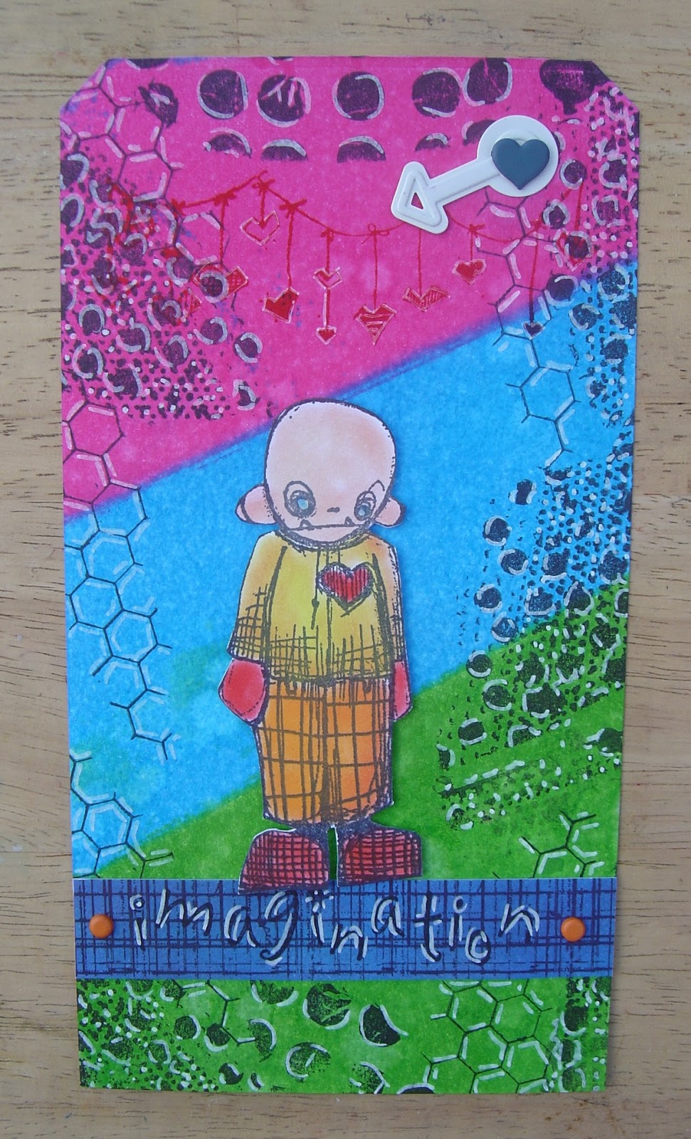
This tag was created with three of the sprays, a green, an orange and a yellow. A layer of a yellow shade of pan pastel, stamping in perfect medium and the same yellow over the top.  Some parts of the same stamps were stamped in black archival.  The main Stampotique image was stamped in archival.  The words were stamped on a separate piece of card, cut out and stuck on.


These three tags were created using the ink sprays for the background, stamping in  perfect medium and going over the images with different colours of pan pastels.


These two tags were all pan pastels.  Various shades of greens for the left and a blue, purple and magenta for the right.  Again the images were stamped in perfect medium.


Pink, purple and blue ink was used to create the background, the images were stamped in perfect medium and Black (800.5) pan pastel was used to lift the images. 


Purple and magenta pan pastels were used for the background, stamped in perfect medium and a blue was used to lift the main image, purple was used for the others.


For this one I just used the one colour, Burnt Sienna Shade (740.3).  It was amazing to see how many different shades you can get from one colour depending how it was used.


This background was created with a couple of green pan pastels and perfect medium.


This background was created with spray inks and perfect medium.  Black (800.5) pan pastel was used to lift the images.


And I couldn't go all that way without buying anything now could I!!!

I had a thoroughly enjoyable day.  It was great to meet up and craft with Maz, Neet and Lorraine.

** A couple of things I'd like to share.  Get the proper sponges, they really do make a difference.  Use Perfect Medium as opposed to Versamark or another brand of clear ink pad.  As Dy pointed out, Perfect Medium was made to take the Perfect Pearls!! **


Blog Archive